
Sep 1, 2026Printing & Craft
CMYK vs. Pantone: Achieving Premium Colors on Metal Tins
Learn how surface coatings and printing processes impact your brand's color accuracy.
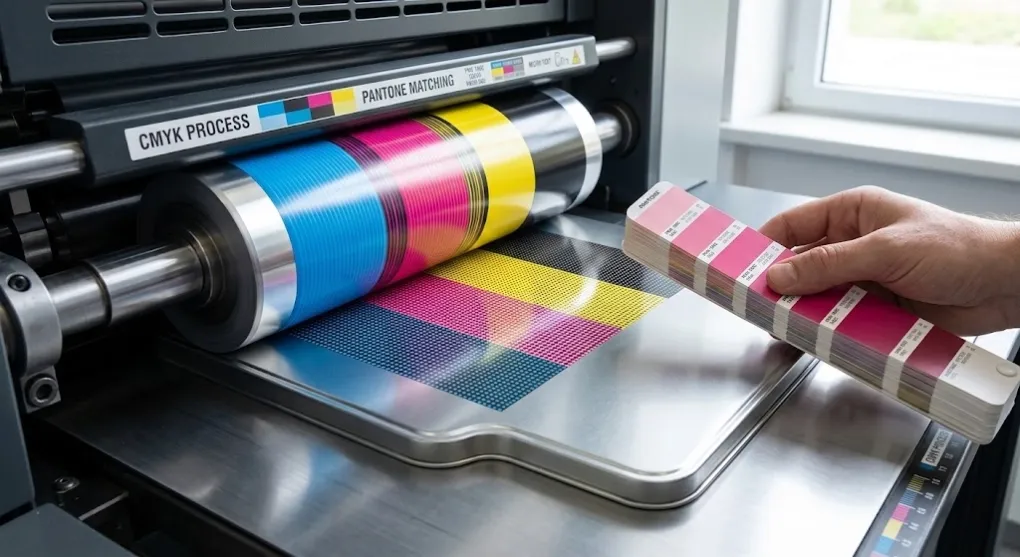
Metal decoration differs significantly from traditional paper printing. Printing directly onto tinplate requires specialized offset metal lithography, curable inks, and custom surface varnishes. To achieve vivid, accurate brand colors on tin boxes, understanding how to apply CMYK and Pantone matching systems (PMS) on metal substrates is essential.
1. Understanding CMYK Process Printing on Metal
CMYK (Cyan, Magenta, Yellow, Key/Black) uses four standard inks overlaid as microscopic dots to produce full-color imagery, gradients, and detailed graphics.
- Best used for: Complex illustrations, photographic imagery, multi-color artwork, and detailed holiday themes.
- Consideration on Metal: Because tinplate is inherently reflective and silver-grey, printing CMYK ink directly onto raw metal creates a metallic, translucent effect. To achieve true-to-life CMYK colors, a White Base Coat (White Ink Primer) must be applied first.
2. Spot Colors & Pantone Matching System (PMS)
Pantone printing uses pre-mixed custom inks to ensure precise color consistency across production batches.
- Best used for: Solid brand logos, corporate identity colors, flat background tones, and metallic accents.
- Advantage: Eliminates dot-pattern artifacts and shade variations often seen in CMYK spot areas, guaranteeing 100% brand consistency globally.
3. The Role of Base Finishes & Coatings
The underlying metal finish drastically transforms the final printed appearance:
- White Base Coating: Acts as a blank canvas. Ink printed on white base coat reproduces colors almost identically to high-end paper packaging.
- Clear Varnish (Metallic Effect): Omitting the white base coat allows the natural sheen of the tinplate to shine through the printing ink, creating eye-catching gold, copper, or colored-chrome effects.
- Matt vs. Gloss Finish: Gloss varnish enhances color saturation and depth, while matt varnish provides a subtle, sophisticated, touch-friendly surface that reduces glare and fingerprints.
4. Expert Tips for Color Accuracy on Tins
- Always Request a Metal Proof (Sample Tin): Colors rendered on paper proofs or digital screens look different when cured under high temperatures on tinplate.
- Combine CMYK and Spot Colors: For high-end packaging, use CMYK for background illustrations and 1-2 Pantone spot colors for core logo branding.